Assignment 1: The Beginning
Posted: Wednesday, January 27, 2010 by Siti Suhailah in Labels: Assignment 1So the first assignment for the semester would be to edit the current CNM website according to the guidelines given to us via the NUS Web Design Guidelines file. Yep. Pretty cheeeem stuff I thought. Hmmm...
The first idea that came to my head was to create a simple clean-cut layout that pays more focus to the links which students are more likely to click on. Just using my common sense I guess. Furthermore, I have my own opinions about the current website already that I would like to change. Well, I might as well list them out right now. This might come handy when my group decides on what would make the best design layout for this website.
Before I list my potential changes, I actually thought about the aspects that I must consider when I am designing a website with this specific purpose:
1. Target Audience: Important to know who is my target audience (who will be looking at this website, basically). A professional look would make our department look more.... worthy of entry and if its too colourful or too much design, it will be more of a distraction as opposed to being useful, as when someone visits this website, chances are that they are there to find information fast, and not to be wowed or mesmerised by the design they see on the main webpage, and to find themselves a bit confused or taking a while to adjust and learn how to navigate through the website. I want their learning curve to be next to nothing. Zilch. They can totally navigate their wair around the website intuitively. It's all about INTUITION!
2. Accessibility of links and information layout: Must consider how information will appear, in what manner, and how links will be formed from a set of info to another set of related info. I'm trying to imagine a potential, possibly better overall sitemap layout that could serve as a better website than the current one. Navigation is key. fast navigation, quick links, big buttons are best in my opinion.
3. Time taken to load: The time to load must be fast too. Cannot be so slow. Thus although I originally wanted everything to be a Flash applet, I realsied that it would take a long time to load. Plus all the hassle in updating the information via Flash. Now that would just be a pain in the *****.
Here are the changes (in general) which I hope to implement for my new website design:
1. Header: Right now, we don't seem to be conforming the header with the guidelines' one. So we're gonna be doing that I expect. I do have the preference of using the blue header instead of the orange one. Since I'm so used to seeing the CNM website in blue. Haha... :)
2. Links: In any website, I think it's good to have a few key links being highlighted or given precedence over other links. Rather than having all the links placed in a list to the left side. I would 'highlight' the links which I think are the most important or the links that students go to the most.
3. Displays of students' work: I thought that since we're a CNM major, CNM students regularly produce all sorts of designs and media forms as part of our regualr assignments and projects in various modules. But no one every gets to see it! :( I later on found out from my fellow classmate that she felt the same way. My idea was to have a form of platform to showcase certain digital media on the website. For display purposes. Which I thought would be cool I guess. So far, everything that I hope to design, I'm capable of scripting it out, plus the Flash and wat-not, since I know how to create Flash movies (I did Flash games before though). But I am trying to find better ways of displaying the work and making it easy for students to donate their work to the CNM department for display. If only I could find an proper outlet....
Other changes that I intend to make would probably be the CSS style sheets the website uses and such, particularly for the print and screen. Those would be according to how well and easy it is to read on screen/paper. The rest I think I will be discussing with my team about it soon enough! :)
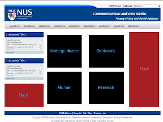
Here's just the rough 'sketches' I did to realise my designs, very minimalist I'd say. I love straight lines, straight cuts, clean and crisp edges, very simple without the hassle of shadows and bevelling and such. I think they are just too detailed for my taste.

